Mastering Color Psychology: Plastic Card Design Tips and Tricks
Color Psychology Plastic Card Design
Welcome to the World of Color Psychology in Plastic Card Design
In a world where communication is often dominated by words and images, the subtle language of colors plays a crucial, yet often overlooked role. Here at Plastic Card ID , we've harnessed this powerful form of non-verbal communication through the thoughtful design of our plastic cards. By tapping into the rich field of color psychology, we ensure that each card is more than just a functional item; it's a statement, a piece of brand identity, and a trigger of specific emotions and actions.
Color has the power to influence mood, perception, and even behavior. That's why our card designs are carefully crafted to resonate with the intended audience, driving engagement and strengthening the connection between the brand and its customers. When you hold a card designed by us, you're experiencing a deliberate curation of colors, each chosen to evoke a specific response.
As experts in plastic card design, we understand the impact that the right color combination can have on the user. Whether it's the calm authority of blue or the energetic punch of red, our designs are meticulously planned to align with our clients" brand values and goals. It's not just a card; it's a nuanced communicator in your pocket.
Discovering Color's Emotional Influence
At the core of our design process is the understanding that color can convey emotions as effectively as any word or picture. A bright yellow might lift spirits and inspire positivity, while a deep green could represent growth and harmony. Harnessing these emotions, our cards become tools that subtly influence the holder every time they're seen or touched.
This attention to emotional detail sets us apart and ensures that your brand isn't just seen-it's felt. By aligning the colors of your card with the emotions you wish to evoke, we help create a powerful, lasting impression on your clients and stakeholders.
Color Choices That Drive Action
It's not enough for a design to simply look good; it needs to inspire action. Whether it's encouraging a customer to make a purchase, improve recall of your brand, or elicit loyalty, the colors of your card can make all the difference. For instance, an orange call-to-action can create a sense of urgency, while a blue background might inspire trust and reliability.
Our team spends ample time researching and understanding how different shades and tones can affect behavior. This enables us to craft card designs that not only stand out but also drive the responses you're aiming for.
Creating Consistency Across Your Brand
Consistency in your visual branding is key to recognition and trust. That's why, when it comes to plastic card design, it's crucial that the colors we use are in harmony with your existing branding. We carefully match hues to your logos, your marketing materials, and your corporate identity to ensure a cohesive brand experience.
Our commitment to brand consistency means that every interaction with your card reinforces the identity and values of your business, fostering brand loyalty and an instantly recognizable visual presence.
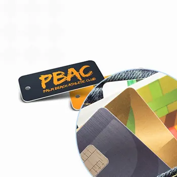
Get an Instant Quote
Click the image above to get started!
The Strategic Selection of Colors for Optimal Impact

Incorporating the Right Colors for Your Industry
The industry you're in can greatly affect which colors are most effective for your card design. Certain colors have become associated with particular sectors, and we use this to our advantage. The palette choice for a tech company may lean towards sleek silvers and cool blues, suggestive of innovation, whereas a health and wellness brand might favor serene greens and soft whites, implying tranquility and purity.
By considering these industry standards, as well as the unique aspects of your brand, we ensure that the card design resonates with your audience and stands strong against competitors.
Selecting Colors for Target Demographics
Understanding your audience is at the core of effective design. Different demographics often have varied responses to colors. For example, youthful, vibrant shades might appeal to a younger audience, while more reserved, muted tones could resonate with a more mature demographic.
We delve into the psychology behind these preferences to tailor your plastic card design to appeal directly to your target market, enhancing the card's appeal and effectiveness.
Ensuring Readability and Clarity
While aesthetics are essential, readability should never be compromised. Our designs maintain a balance between beauty and functionality, ensuring that all text is easily legible against the background color. A well-contrasted color scheme is vital to ensure that important details like your contact information or branding message are not lost.
When it comes to the finer details, we employ the same close attention to ensure that the card is as user-friendly as it is visually impressive.
Towards a Brighter, More Connected Experience

Colors do much more than fill space; they tell a story, set a mood, and can even drive performance. At Plastic Card ID , we don't just supply plastic cards; we provide a carefully crafted brand experience that resonates with everyone who comes into contact with it, nationwide.
Whether you're looking to place a new order or have questions about our products and services, don't hesitate to reach out. We can easily be reached at 800.835.7919 , ready to guide you in making the right color choices that embody your brand and engage your audience. Remember, a subtle shift in color might be all it takes to ignite the right emotion, encourage loyalty, and prompt the desired action.
Unveiling the Science Behind Our Color Selection
At Plastic Card ID , we don't pick colors at random. Our selection is rooted in the psychological and cultural meanings of colors, ensuring an informed design that speaks volumes without saying a word. We study the latest trends and research, blending art with science to develop card designs that truly represent your brand.
Our commitment to high-quality plastic card design is what sets us apart. We offer a palette of possibilities, creating connections between your brand and your audience through the strategic use of color.
Maximizing the Power of Your Card
Your plastic card is a powerful tool, and we make sure it performs at its best. From the shade selection to the finishing touches, each decision is made with your brand's success in mind. By tapping into the emotional and psychological influences of colors, your card will not just represent your brand but amplify its essence.
Let us show you how the right color combinations can transform your plastic card into a compelling and effective brand asset.
Your Guide to Responsible Card Usage
While we focus on the beauty and functionality of our card designs, we also consider the journey of a card after its use. Simple recycling advice for plastic cards is part of our commitment to you and the environment. When a card has served its purpose, recycling it responsibly ensures a better future for all.
We may not offer eco-friendly options, but we proudly share basic guidelines to help in the responsible disposition of our products.
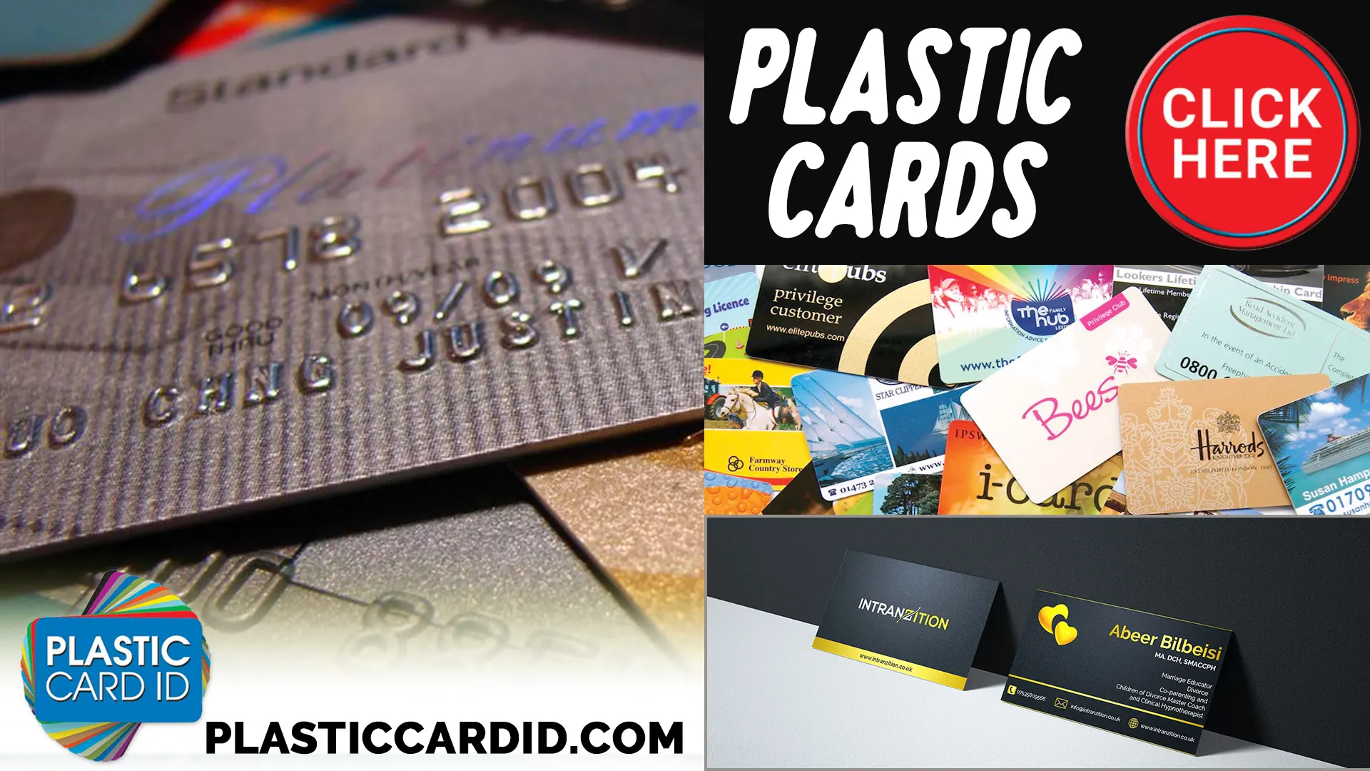
Get an Instant Quote
Visit PlasticCardID to get started!
Get an Instant Quote
Visit PlasticCardID to get started!
Connect with Plastic Card ID for Colorful Engagements
In the pursuit of crafting the perfect card for your business, the language of color is our ally. With color psychology woven into the fabric of our designs, every card produced by Plastic Card ID serves as a silent ambassador for your brand, radiating the right emotions and prompting the desired actions.
The right color selection can turn a simple card into a nuanced communicator. Let us be your partner in this colorful journey. Reach us easily, nationally, for new orders or any enquiries at 800.835.7919 . Embark upon a vibrant path to success, where your brand's message isn't just delivered-it's felt and acted upon.